
Noticed this today!
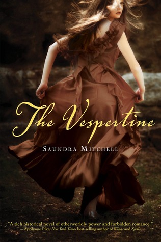

On the left is the US hardcover edition of Saundra Mitchell's The Vespertine which came out last March from Harcourt Children's.
On the right is the Australian paperback edition of The Goddess Test by Aimee Carter which released in April 2011 from Harlequin Teen.
I would love to see the process by which book covers are designed and made. Especially in this case since these 2 released so close to each other. Don't you think people would check to see if an image had already been used elsewhere? Do you think this model knew her picture would be on the cover of not 1 but 2 books? Is it even an actual picture or was it computer generated?
I personally though the cut off head was a little strange on The Vespertine cover when I first saw it but after seeing the complete image, I don't know that I like it any better.
What do you guys think?
Oooo I hate when this happens.
ReplyDeleteI agree with Juju. This REALLY bothers me!
ReplyDeleteI detest it as well!! It's very frustrating & typically causes me to buy multiple versions of the same book. Quite aggravating!!
ReplyDeleteOh no, that's terrible! But I guess if you're going to buy an image for a book cover, you would run the risk of this happening? The company/artist that owns the image might not know what its being used for when the rights are sold, and with millions of books out there you can't check them all.
ReplyDeleteI tend to think that the majority of YA books, particularly those with a female protagonist, have rather blase covers. They usually involved an image of some girl dressed in a provocative or colorful dress, with a serious expression on her face. The images don't usually tell us much about the story at all and could be interchanged and no one would care. Seeing these two covers confirms my suspicions that in too many cases generic images are plucked from hyperspace and slapped on a book. I prefer cover images that are really unique, speak to the story itself, and make a book stand out from the crowd. Some of my favorite YA covers of late include Ashes, Fracture and Article 5.
ReplyDelete